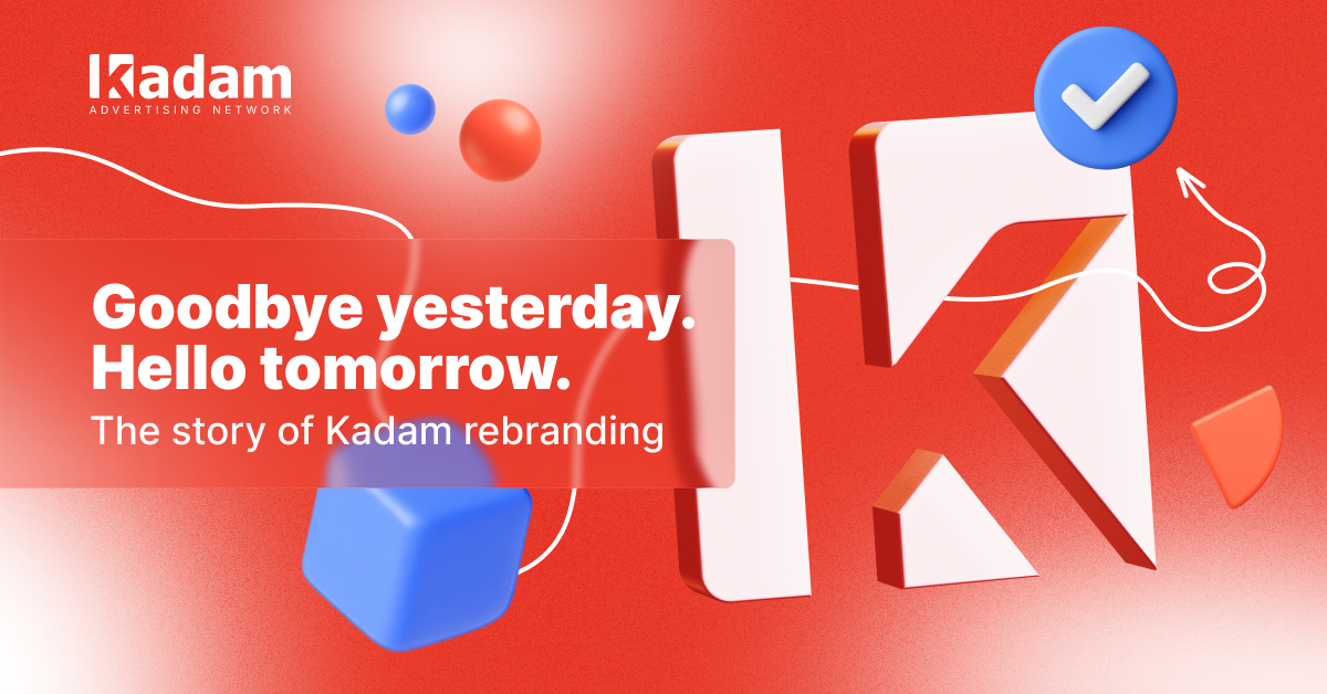
The brand you’ve heard of.The brand you’ve seen.The brand you know.The brand you grow with.Kadam. Since 2012, Kadam has been shaping the affiliate marketing landscape. Over more than a decade, we’ve evolved, adapted, and anticipated the ever-changing needs of the industry. Each transformation has brought us closer to where we are today – and now, […]
#Events & Community
30 Sep 2025
Kadam
The brand you’ve heard of. The brand you’ve seen. The brand you know. The brand you grow with. Kadam.
Since 2012, Kadam has been shaping the affiliate marketing landscape. Over more than a decade, we’ve evolved, adapted, and anticipated the ever-changing needs of the industry. Each transformation has brought us closer to where we are today – and now, we’re not just following trends, we’re setting them.
Kadam has earned its reputation as a trusted partner: a powerful traffic source for advertisers and a proven monetization solution for publishers worldwide.
What defines us?
Leading Ad Formats
High-quality global traffic
Advanced retargeting tools
Real-Time Bidding (RTB) system
Microbidding
Built-in anti-fraud protection
Dedicated support
And much more.
Kadam isn’t just a network. It’s a platform built on innovation, trust, and growth – for you, and with you.
Why Rebranding?
For years, Kadam has been recognized by its signature look: the red-and-white palette, the clean shapes, and the logo familiar to nearly everyone in the industry. That visual identity carried us through countless milestones. But now comes the question: why change what’s already well-known?
The answer is both simple and powerful: evolution.
Market Growth. The affiliate marketing world is expanding at lightning speed. Being one of the oldest and most trusted networks is no longer enough – recognition must transform into memorability. That’s why we are refreshing our visual identity: to stand out not just as a player, but as a brand that leaves a lasting impression.
New Challenges. Our industry never stands still – and neither do we. Kadam continuously enhances existing services while building the technologies and tools of tomorrow. We believe our visual style should reflect that same forward-looking energy: bold, modern, and ready for what’s next.
Love for Our Partners. At Kadam, we’ve always valued the trust of our advertisers and publishers. But we want to give more than great traffic and reliable tools – we want every interaction with Kadam to feel inspiring. From the clarity of our interface, to the energy of our events, to the very design of our brand – every touchpoint should reflect the care we put into our partnerships.
This rebrand is not just about new colors or shapes. It’s about creating a visual identity that mirrors who we are today: a company built on trust, driven by innovation, and deeply connected to the people who grow with us.
How does rebranding reflect our core values?
Our new style is more than just a visual change – it’s a mirror of how we see Kadam today and how we lead it into the future. Each design choice carries meaning, each detail echoes our vision.
Client-oriented. We put people first. Every tool, every service, every decision is built around our partners. Their growth defines our own.
Bold. We embrace change with confidence. Innovation isn’t just part of our journey – it’s the path we create by setting trends rather than following them.
Cutting-edge. Technology drives us forward. Our solutions stay ahead of the curve and help shape the future of the industry.
Easy to use. Complexity belongs to the backend. For our partners, every interaction with Kadam should feel seamless, clear, and intuitive.
Flexible. No two partners are the same. That’s why we adapt – to markets, to challenges, to individual goals – offering solutions that go beyond the standard.
Together, these values come to life in our mission:
We create innovative advertising technologies that empower advertisers and publishers to achieve their goals more easily, effectively, and affordably.
What are we at?
We are now working on rolling out our new design strategy across all assets, including the website. But you can already spot some of the core elements in action:
Over the past six months, we’ve been dedicated to reshaping our visual identity – one that not only reflects our vision and values but also preserves the familiar sense of trust and closeness that our partners have always associated with Kadam. A brand that feels almost like family, now with a brighter, more modern face.
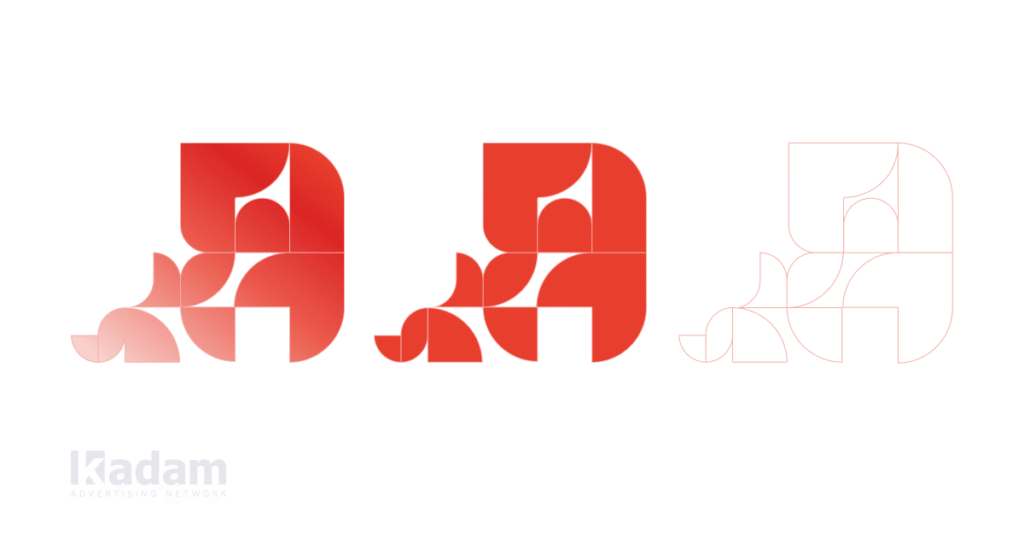
Logo. Our logo remains – recognizable and beloved – but with a refreshed spirit. Its lines are more modern, its edges smoother, its angles softer. Just like our approach to clients: professional, yet warm; innovative, yet always human.
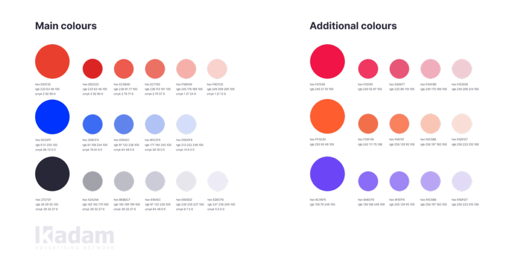
Colors. We’ve expanded our once-strict color palette, introducing richer shades and more vivid tones. Unique designs, bold contrasts, and a fresh visual impact – now every color tells the story of Kadam, reflecting our energy, innovation, and forward-looking spirit.
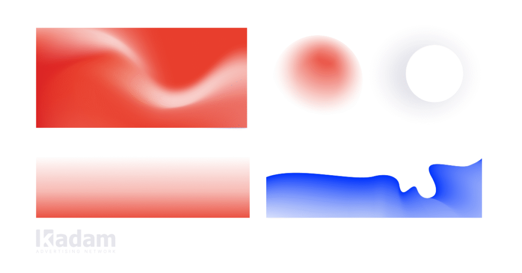
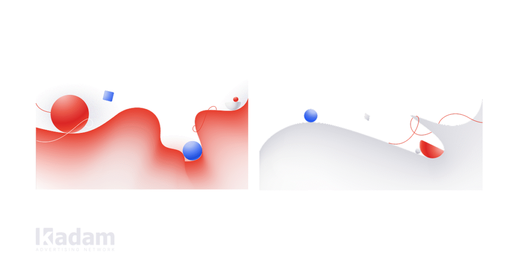
Gradients. At Kadam, the gradient is a metaphor for the client journey and our dynamic growth as a company.
A smooth transition represents the movement from testing to scaling, reflecting the natural evolution of campaigns and partnerships.
The blend of warm and cool tones symbolizes the balance between emotion and analytics, combining creativity with data-driven decisions.
Finally, the direction of the gradient serves as a vector of growth – moving from left to right and bottom to top – illustrating progress, upward momentum, and continuous development.
Through this approach, every gradient in our visual identity is designed not only to be aesthetically pleasing but also to tell the story of growth, movement, and the journey we share with our partners.
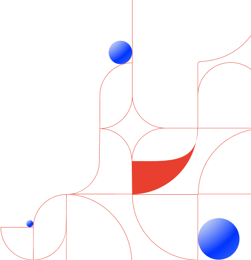
Patterns. The Kadam pattern is an abstract geometry built from a combination of rounded and straight shapes. This combination symbolizes a balance between technological precision and creativity, reflecting the company’s philosophy.
It evokes associations with movement, scalability, and flexibility, directly mirroring Kadam’s work with traffic, as well as business growth and dynamism.
Moreover, the pattern is highly adaptable: it can be easily applied across different media, used with gradients, flat colors, or in a monochrome palette. This flexibility makes it a versatile tool for visual communication, effectively supporting the brand in various visual contexts.
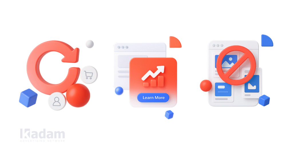
Vector graphics. Bright, dynamic, and easily scalable without losing quality – vector graphics play a key role in Kadam’s brand style. They rely on the company’s signature gradients (red, blue, and gray) and abstract shapes to create a modern, technological impression.
Vector graphics convey the energy and innovative spirit of the brand while making content stand out in the information flow. They are highly adaptable across formats and media, which makes them perfect for various use cases. Moreover, vector-based visuals seamlessly fit into animations – whether it’s videos, reels, or banners – enhancing engagement and giving the brand a recognizable, cutting-edge aesthetic.
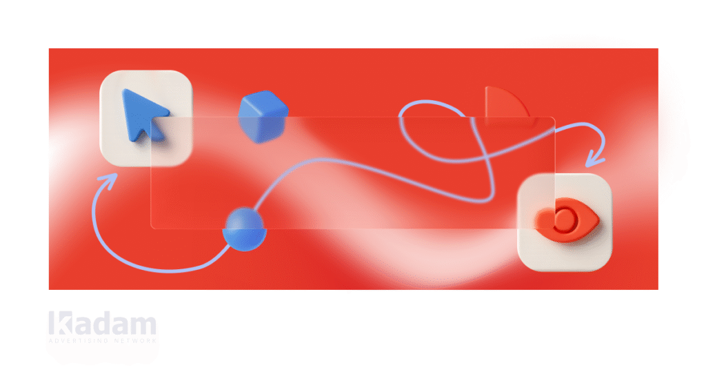
3D Illustrations. Kadam’s 3D illustrations are designed in a minimalist and friendly style. They combine clean geometry, soft shadows, a crisp white background, and the brand’s signature colors – rich red, vivid blue, and neutral gray. This approach creates visuals that are modern, approachable, and instantly recognizable.
These elements together convey a sense of accessibility and ease of interaction, highlight the image of a cutting-edge digital product, and emphasize confidence and partnership.
Glass Texture. Lightweight, transparent, and modern – the glass texture creates a sense of depth and “air” in a design, highlighting the premium quality of the brand.
Glass-style elements work well as background blocks for text (especially to emphasize headlines and CTAs), overlays for cards in social media and emails, decorative interface details, and visual accents in presentations. In all these cases, the texture adds refinement without overloading the composition.
By applying the glass texture thoughtfully, Kadam ensures its visual style feels both elegant and technologically advanced, while keeping clarity and usability in focus.
Amazing Update! Kadam Blog released
We’re thrilled to open the doors to the Kadam blog, a place where knowledge sparks growth and insights turn into opportunities.
Here, you’ll find:
Market insights about trends shaping the industry, helping you stay ahead of the curve.
Real-world case studies that reveal the stories behind successful campaigns, breaking down strategies you can actually use.
Smart tips on monetization and advertising to fuel your growth, boost results, and make every effort count.
This isn’t just a blog. It’s a space to share what we’ve learned, so you can grow faster, make bolder moves, and create impact that lasts. At Kadam, we believe knowledge is most powerful when it’s shared – and our goal is to empower you to reach new heights.
Dive in, get inspired, and let’s shape the future together. The Kadam Blog is your guide, your toolkit, and your source of ideas that turn into action.
What Remains Unchanged
As we grow and embrace new opportunities, some things remain steadfast.
Our core principles – efficiency, honesty, and unwavering support for our clients – guide every decision we make and every project we take on. These values are not just words; they are the foundation of our work and the promise we make to those who partner with us.
Our team, technology, and commitment to service quality continue to be the driving forces behind everything we do.
Behind every campaign, every solution, and every strategy, there is a team dedicated to excellence, equipped with the tools and expertise needed to deliver measurable results.
Most importantly, our partners can trust that stability, reliability, and transparency remain at the core of our relationships. Even as we innovate and evolve, we never compromise on providing consistent support and guidance.
In Conclusion
Rebranding is a step forward – a reflection of our growth and the path we’re forging. We invite our partners and readers to join the conversation: subscribe to our blog, share your feedback, and engage with our community.
Let’s close the old door, and open the new one together to the future!
26.08.2025
Launch your Campaign!
Create full funnel campaigns that drive real business results.